Redesigning the I lOVE NY logo
THE EVOLUTION OF AN ICON
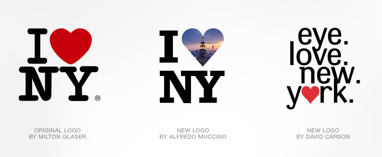
Shortly after Alfredo Muccino moved to New York and started Solid Branding, the City of New York asked him to re-imagine the iconic “I LOVE NY” logo originally designed by legendary Creative Director, Milton Glaser. Mr. Muccino partnered up with his friend, Mr. David Carson, the controversial designer who had also moved to New York City, and the two embarked on the dangerous quest of evolving a much loved icon.
A SHORT HISTORY OF NEW YORK
How Milton Glaser helped revitalize his beloved city
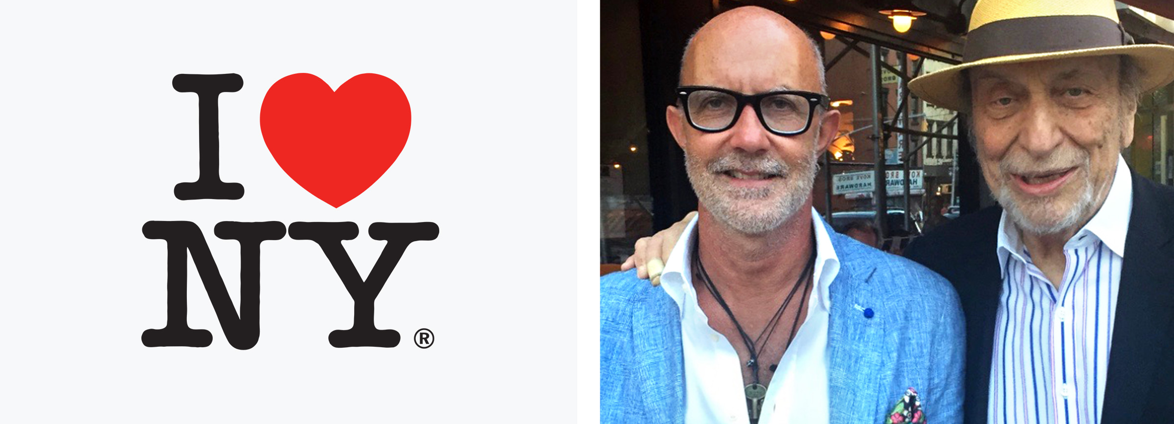
The “I LOVE NY” was created by Milton Glaser and first used in 1977 to promote the city and state at a time when the crime was at an all-time high and New York was far from the tourist destination it is today. Wanting to make a difference, Mr. Glaser did the work entirely pro-bono, in the name of helping the city rise again. “That’s how it should be,” he told graphic designer Chip Kidd in an interview in The Believer. “You want to do things like that, where you feel you can actually change things.” Today the icon generates more than $30 Million a year in revenues for the City of New York.
In the photo above, Milton Glaser is seen with Alfredo Muccino, shortly after Alfredo move to New York.
CARSON HAS HIS EYE ON NEW YORK
David Carson’s logo expresses his love for typography
According to Mr. Carson “In my version, the type is the star. The way the type is stacked is offered a slight hint of the city’s tall buildings. New York is all about what you see, thus the “eye”. People really “love” NY. Love is everywhere in the city”. While the original logo will always be around”, Mr. Carson added, “these official new versions speak to a modern New York, each one of the new versions along with the original represents something unique about New York. The way I see it, this city is all about choices, and now you have three.
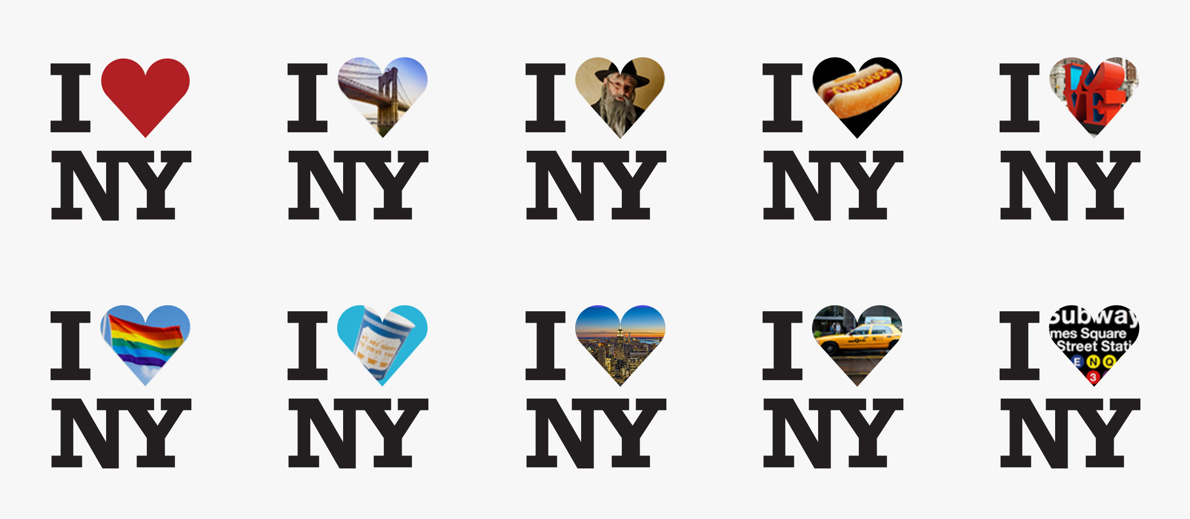
A WINDOW INTO NEW YORK’S HEART
Alfredo Muccino designs a system that is in constant change
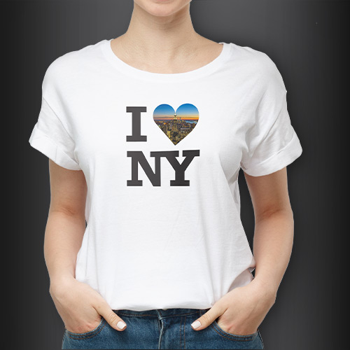
Alfredo Muccino’s designed as a flexible system featuring images and textures that represent the many facets of New York. “I started by replacing the font in the current logo with one that is a bit more structured and bold – but did not stray too far from Milton’s design” explained Alfredo, describing his process. “More importantly, I wanted to represent the icon as a window into New York’s heart. I envisioned that people could change the images and interpret New York as they see it, making the icon a dynamic symbol that is constantly changing and evolving – just like the city itself”.
We’d like to thank Mr. David Carson for participating in this little project and being a such a great collaborator. And we’d like to offer our apologies to Mr. Milton Glaser for having a little fun with his iconic logo. We love New York.

