How we built a better brand for a fast growing
dental services company
THE FIVE LAKES REBRAND
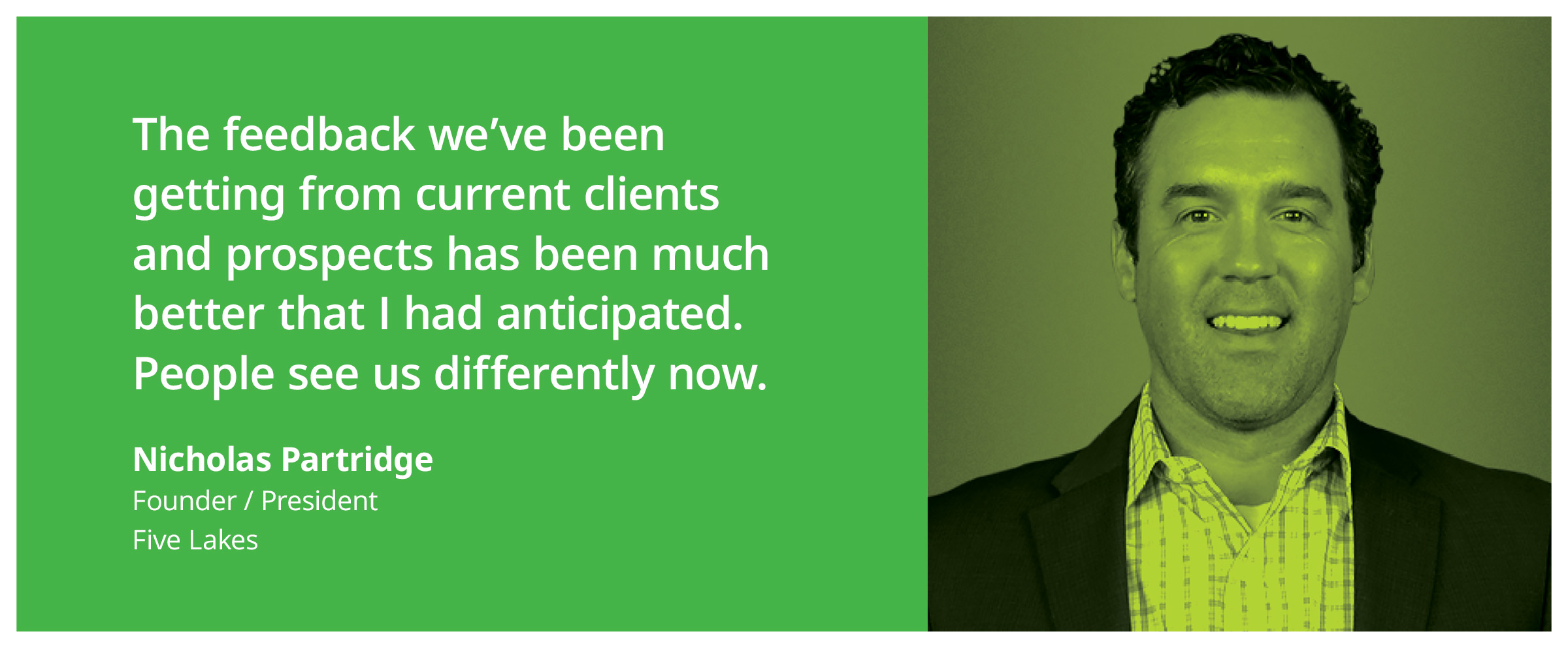
When we first started talking with Nick Partridge, the Founder/President of Five Lakes, he told us he needed a new website. His company was growing fast and, as it often happens, they had not been able to focus any resources on a website update. However, it soon became apparent that his company would benefit from a comprehensive rebrand. So, working alongside Nick and his marketing team, we designed a new logo and brand language, crafted a more effective messaging strategy, and launched a brand new, much more approachable website. Here’s how we did it.
a solid strategy delivered faster
No one likes inflated strategy budgets and long timelines
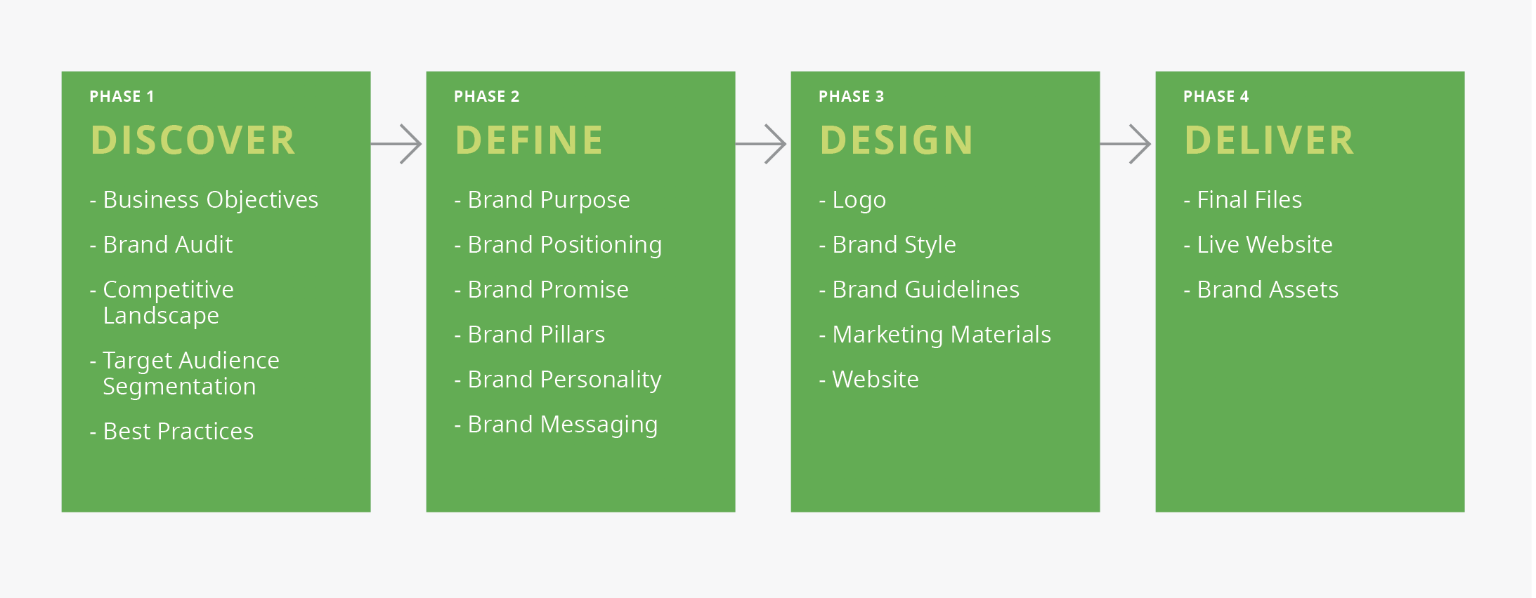
Most comprehensive rebrands can take several months of work with teams that include researchers, strategists, designers, writers, developers, etc. As a result the financial investment is usually substantial. Strategy alone can cost tens of thousands of dollars. We have found that today few companies have much tolerance for time consuming strategy projects and inflated budgets. So, we used the lessons learned during the many years working on brands for fast growing companies in Silicon Valley, and have developed a collaborative approach that allows us to deliver world-class strategic branding programs within a compressed time frame and at a fraction of the cost charged by most traditional brand agencies.
COLLABORATION IS THE KEY
The difference is not about “what we do” as much as “how we do it”
By working collaboratively with our clients we can arrive at better decisions, faster. In order to expedite the work we’ve developed a set of tools enabling clients to actively participate in the process and share ideas, provide feedback and evaluate the work in ways that saves us (and them) a lot of time. Of course, there are times when team workshops or exercises can be helpful, but mostly we avoid these practices. Our approach is faster than conducting individual interviews, group workshops, and creating a myriad of research reports. Savvy management teams can work together very efficiently through virtual collaboration platforms. Besides, most busy executives don’t want to spend a whole day or more tied up in workshops. That said, we firmly believe that research and insights are important in order to develop design work that is strategically sound, so we don’t skip those steps. We just do it more efficiently.
EVERYONE AGREED – IT WAS TIME FOR A MAJOR CHANGE
The brand identity was simply not reflective of the professionalism of the company
After looking at the original Five Lakes logo, website and marketing tools – it was fairly obvious it was time for a fresh start. We discussed this with Nick and his marketing team. We all agreed that the company would benefit from a rebrand, and they gave us the freedom to start from scratch. We give lots of credit to Nick for setting aside his personal attachment to the original logo. It’s often difficult for a Founder to let go of the identity they used from the start. But smart leaders know when to hire experts and allow then to use their skills and experience, and that’s exactly what Nick did.
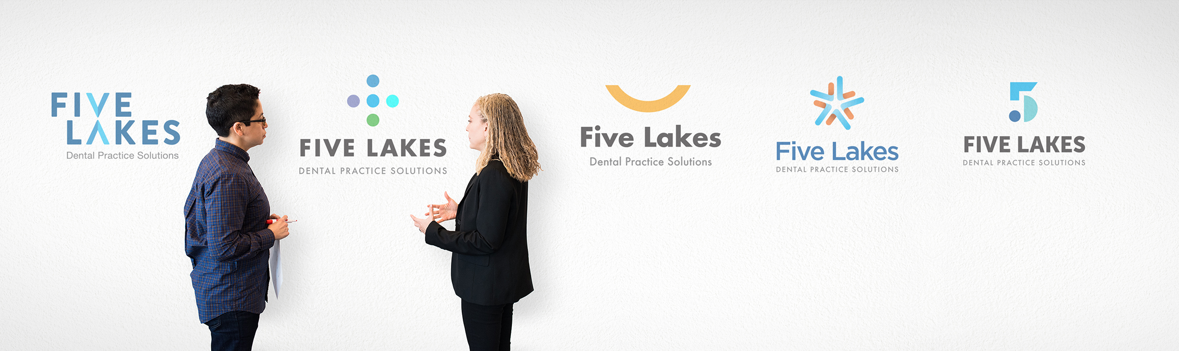
WE OFTEN START WITH THE LOGO
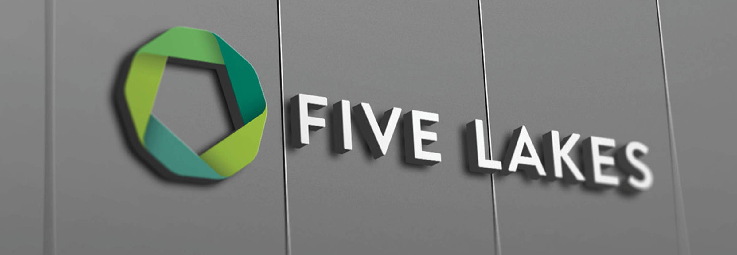
The logo is the most important visual symbol for the brand
Look up the word ‘logo’ in a dictionary and it will describe it as “a ‘symbol’ or ‘icon’ adopted by an organization to identify its brand”. Logos are often displayed next to the company’s name – which is usually designed to appear in a consistent typestyle. Because a logo is a ‘symbol’ that represents a company, we usually build into the design some elements that make the design more relevant and memorable. We always explore a variety of approaches and evaluate the potential of each. Above is a sampling of the alternatives we developed for Five Lakes. After discussing the various options, we ended up selecting the ‘ribbon’ design because we saw in it a number of valuable storytelling opportunities.

A MEANINGFUL SYMBOL
A simple, strong icon symbolizing ‘seamlessly working together’
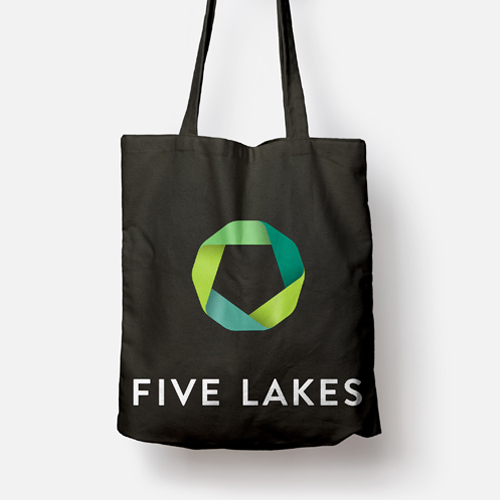
The Five Lakes logo is made of five distinct parts in shades of green. The shapes represent the variety of solutions offered by Five Lakes, as well as the five values upheld by the company. Shades of green were selected because they suggested the nature that surrounds the Five Lakes region – where the company was started. Additionally, the shades of green are common in the dental field, and the color green is associated with concepts of renewal and nature, as well as growth and harmony. Green is also associated with money and finances. The five elements create a single, circular ribbon-like shape. This strong geometric shape with soft edges is designed to represent people and solutions working together smoothly and seamlessly.
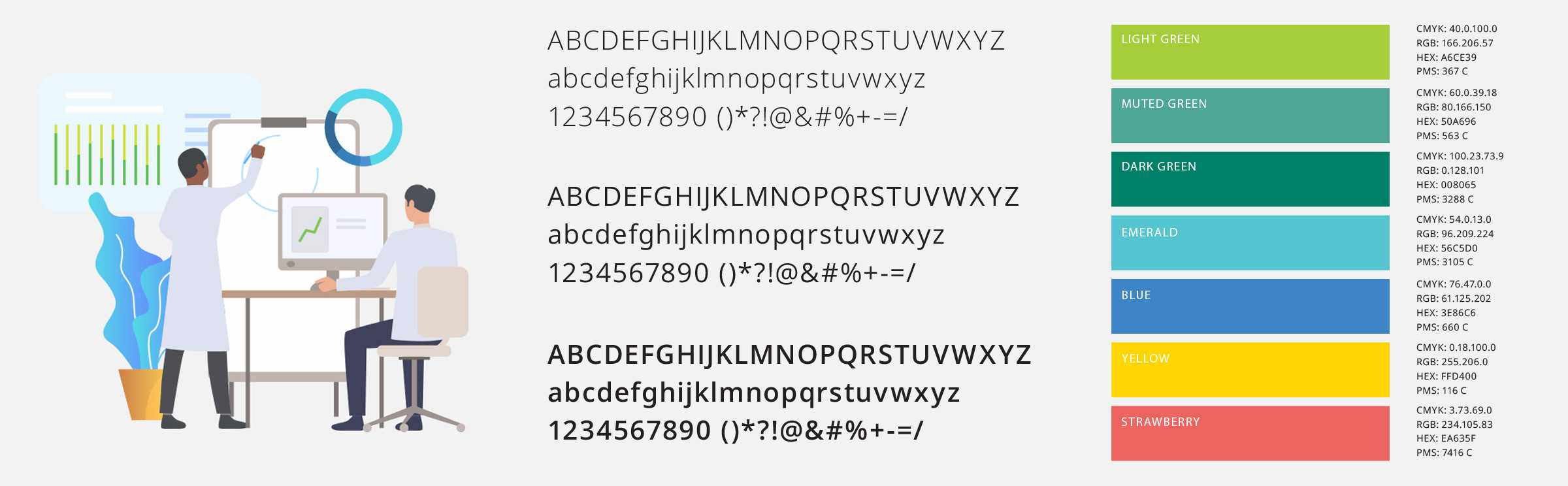
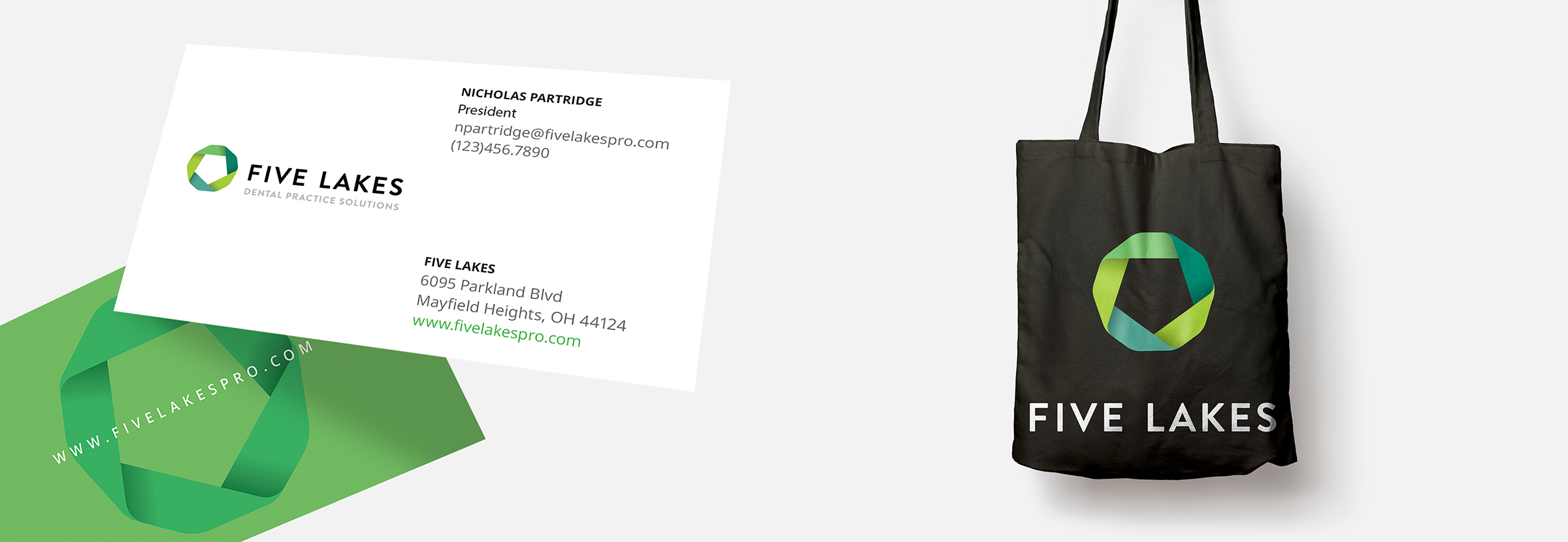
A BRAND LANGUAGE INCLUDES MANY VISUAL ELEMENTS
Illustrations, font families, color palettes, and more
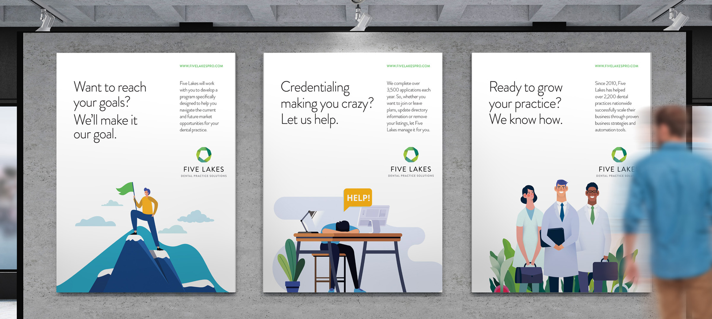
Although logos are a crucial component for any brand, they are not the only way that brands are recognized. A thoughtfully coordinated color palette is a very important consideration. Also, selecting a set of fonts that can adapt to print applications as well as digital formats should be evaluated to ensure maximum legibility across platforms. Consistent imagery style is also important. In the case of Five Lakes, we opted for illustration as opposed to photography. This gave us the flexibility to cost-effectively adapt existing illustrations, while differentiating Five Lakes from other brands in the same category. Illustrations can also convey a friendlier and more contemporary / confident approach than the competition.
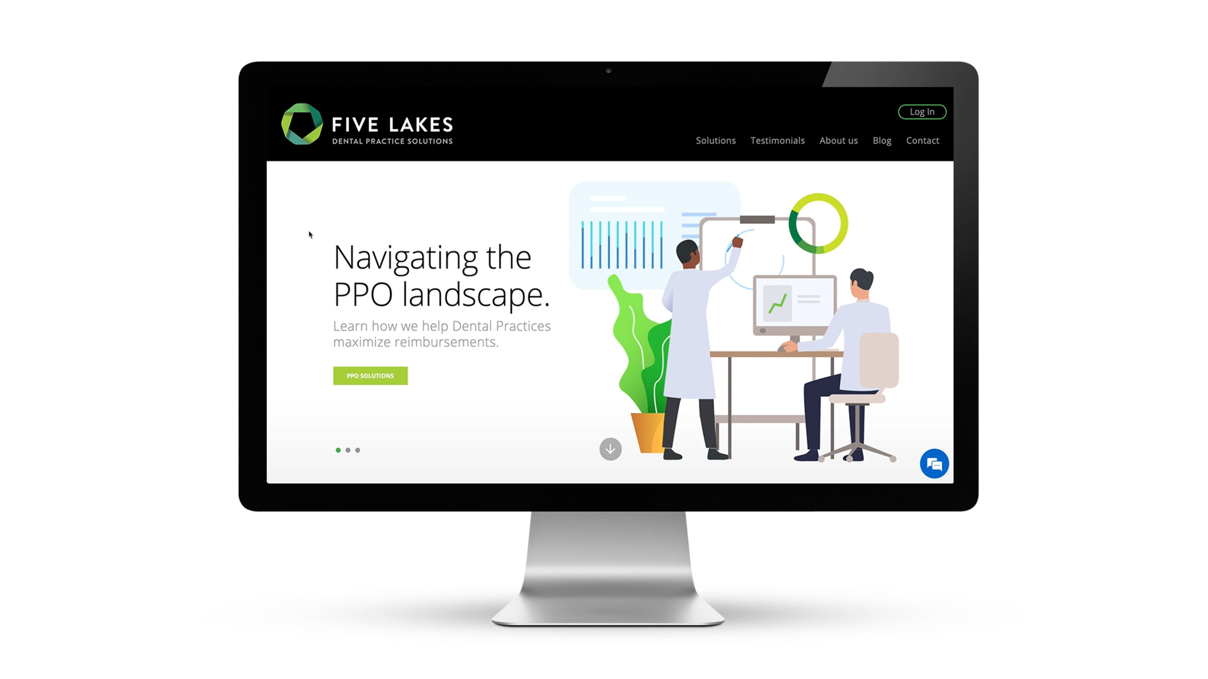
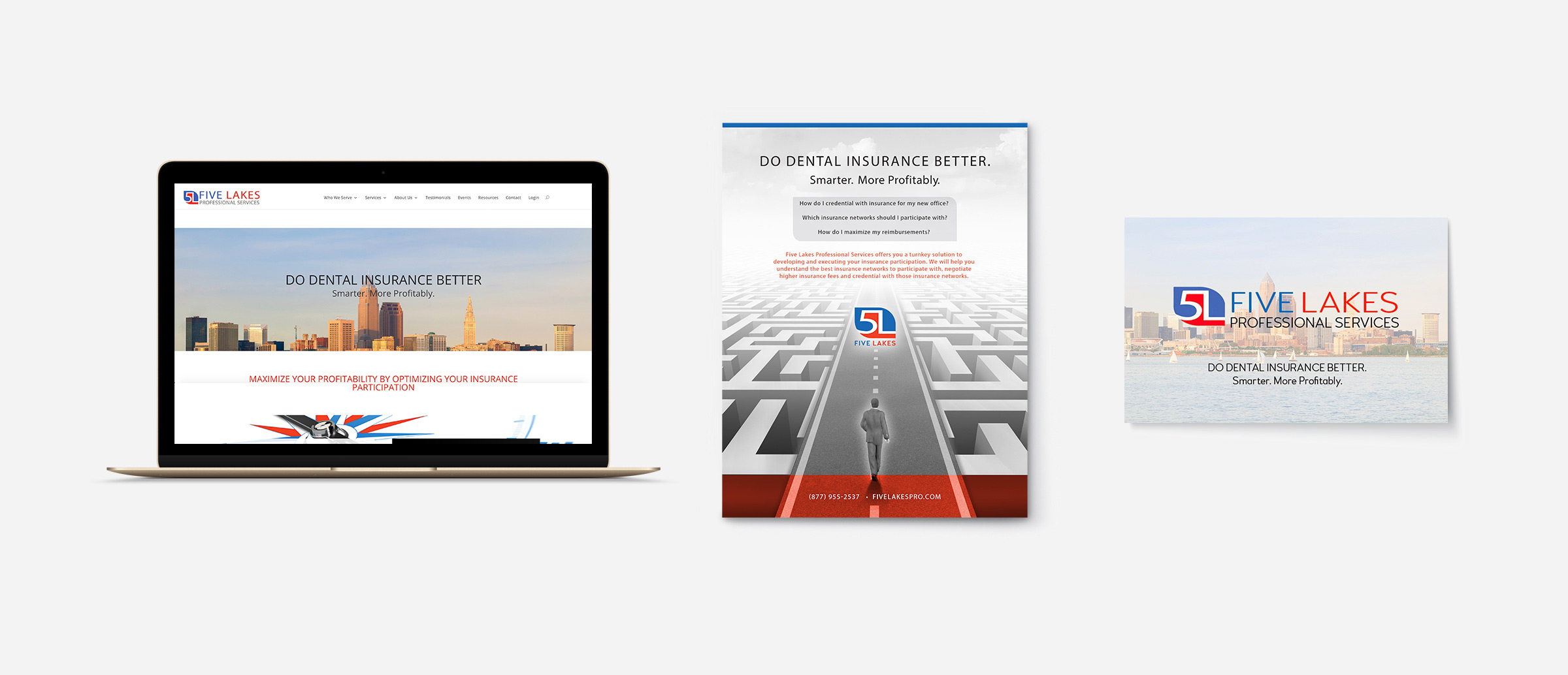
THE NEW WEBSITE is getting rave reviews
We’re happy to report that Five Lakes has received great feedback
The website redesign was a major endeavor. We developed the content strategy and content flow with the goal to simplify the way that Five Lakes presents its offerings, while providing ample detail if a site visitor wants to dig a little deeper. We used illustrations, animations, transitions and effects to make the site experience more compelling on desktop and mobile devices. We also carefully crafted the language throughout the site making it easier to read and understand. Lastly, and very importantly, we took into account best practices regarding SEO to ensure that the site is easy to find on Google searches. In case you want to check it out, here’s a link:
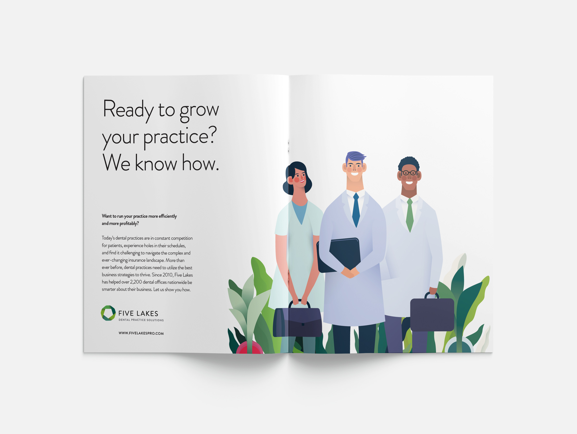
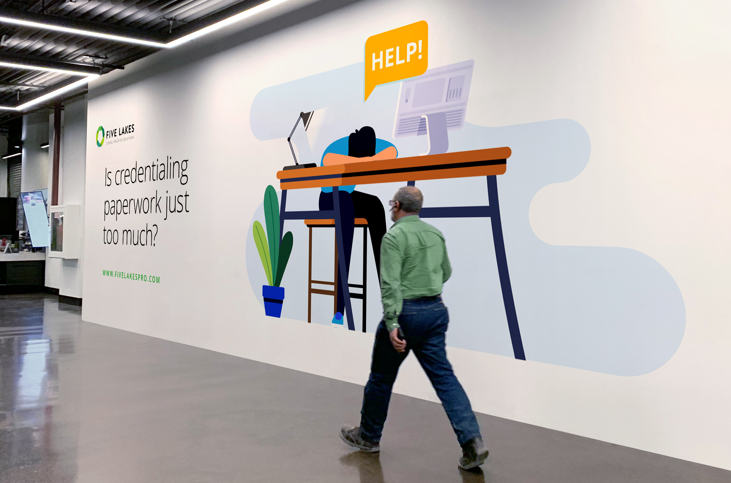
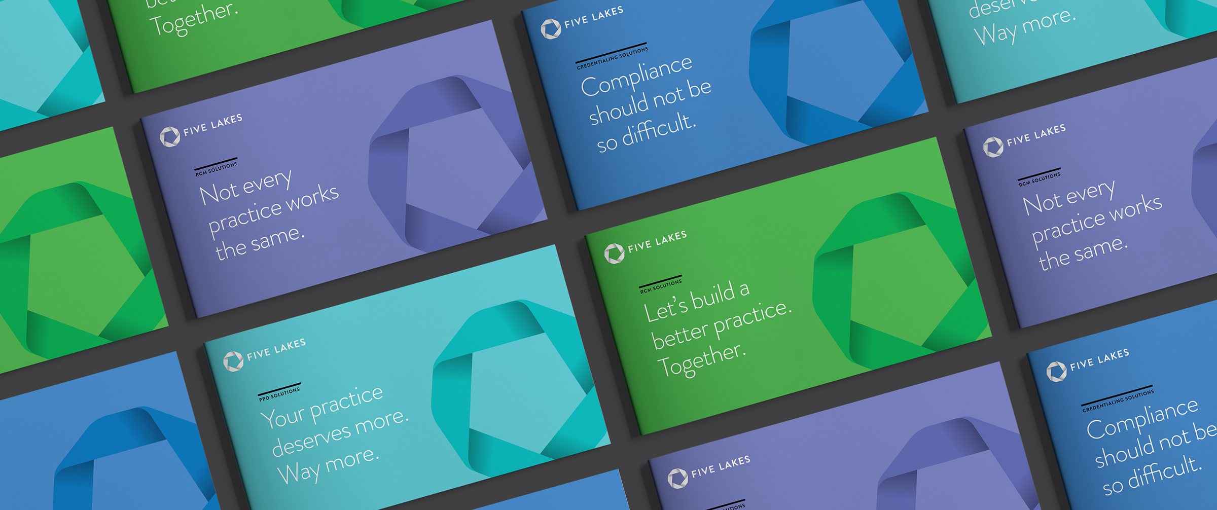
CONSISTENCY AND SCALABILITY
Brands are built through a disciplined and thoughtful approach
Some brands spend millions of dollars in media buys to ensure that they become ubiquitous and immediately recognizable. But media exposure is not the only requirement of smart brand building practices. Recognition is often built through consistency. The best brands are “familiar” because you see the same language, the same colors, the same general approach across every brand touchpoint. When we designed the Five Lakes brand we wanted to make sure that the corporate brand would be flexible enough to adapt to a wide array of applications from advertising campaigns to marketing materials , including physical items like signage and promotional merchandise, as well as digital tools like email, PDFs, video, etc.
What could we do for you?
We help companies launch new brands, revitalize existing brands, and manage transitions due to mergers, acquisitions and divestitures. We deliver strategic branding initiatives that include naming, logos, packaging, websites, videos, environmental and event design, product design, advertising, and much more. Ultimately, we aim to build awareness, differentiation and preference for our client’s brands.
Imagine what we could do for your brand!