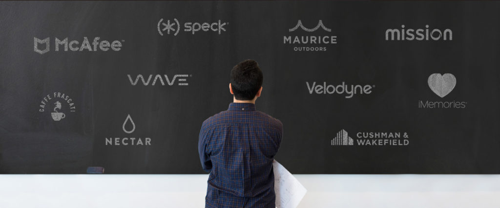
Meet some of our favorite new logos
DESTINED TO BECOME ICONS
Designing a logo often becomes an exercise about “saying no to a thousand things” as Steve Jobs famously liked to say. Designing a logo is about keeping only the most important and essential elements. And when a logo turns out just right, it can become a brand icon for many years to come. Below is a snapshot of logos that we’ve designed over the last few years that we believe will stand the test of time.
MCAFEE
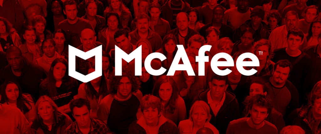
A shield that has become a symbol of security for over 450 million people.
Redesigning the brand identity for McAfee was a daunting task. The old logo already featured a shield and scored very high in unaided awareness. So, working alongside McAfee’s management team, we decided it was best not to invent a new approach, but instead, re-imagine the shield in a fresh and contemporary way. This new logo has been serving McAfee well as the company grows. As of now, McAfee protects well over 450 million people worldwide and almost 85 million corporate endpoints.
NECTAR FINANCIAL
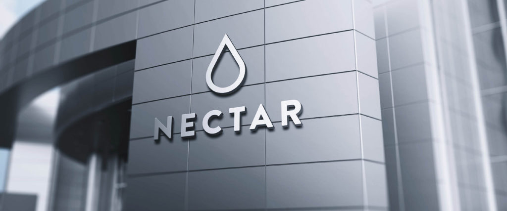
Reinventing the brand for a Swiss company reinventing wealth management.
Wealth management professionals tasked with making the best financial decisions for their clients need access to the best possible insights. They need to access the essential information that can make the difference between success and failure. Nectar leverages sophisticated Artificial Intelligence technology to pinpoint the most valuable insights from millions of financial data points and help wealth managers make better investment decisions. The logo represents a drop of wisdom, suggesting the value of the insights extracted by Nectar for its clients.
MISSION
A brand identity inspired by heroic missions and great achievements.
Reliam, a fast-growing provider of managed services for public cloud platforms, renamed itself Mission and needed a new brand identity. The new logo was inspired by the typography associated with space travel, and the ideas it conjures about embarking on heroic missions. The logotype includes what we call the “dynamic O”, a letter made of two shapes coming together. Mission believes that becoming a trusted partner to help their customers’ reach their objectives, and the logo has become a symbol of their courageous and collaborative spirit.
WAVE
Wave’s new logo evokes the latest advances in data visualization.
Wave Computing is a pioneer in Artificial Intelligence. Their advanced AI solutions enable data scientists to experiment, test, deploy and run AI applications like never before. The new logo for Wave leverages the visual idea of a “wave” in a simple and elegant geometric shape that feels contemporary and sophisticated. At the same time, it represents the dynamic nature of data visualization solutions that are only possible through advanced AI technology.
CUSHMAN & WAKEFIELD
A new logo for one of the world’s largest real estate companies.
When Cushman & Wakefield merged with DTZ, becoming one of the largest real estate services firms on the planet. Management decided that the new company would operate under the iconic Cushman & Wakefield name, and we were hired to evolve the brand identity. We took into account the rich legacies of both organizations and created a new logo that took its cues from the previous brand identity, yet it has its own distinctive qualities. The icon immediately reminds you of modern office architecture, yet the buildings can also be interpreted as bar charts.
SPECK
Seen on millions of devices, this logo is a promise to protect them.
Speck creates award-winning cases designed to protect tech devices such as smartphones, tablets, laptops and watches. The logo consists of an asterisk between two parentheses. The asterisk represents the magical tech devices we use and care about. The parentheses represent how Speck’s products encase and protect those wonderful, yet delicate devices. Today, the Speck logo can be seen on millions of devices worldwide, letting people know that their valuable devices are lovingly protected.
MAURICE OUTDOORS
You can see water and mountains in the logo for a global leader in outdoor gear.
The company was established in 1923 by Maurice Olshansky, an immigrant who escaped from Russia after the revolution and started the business as a pushcart on Maxwell Street in Chicago. Today, Maurice Outdoors is the largest family-operated distributor of fishing tackle, shooting sports accessories, and other out-door athletic goods in the world. The logo was designed to evoke ideas of water, mountains and outdoor activities, while also serving as an iconic monogram for this venerable company.
VELODYNE
A logo that celebrates a legacy of innovation and acoustic performance.
Velodyne subwoofers and audio products represent the fusion of technical innovation with the art of beautiful industrial design. Started by David Hall, Velodyne holds more patents for subwoofer design than any other company. We were asked to evolve the logo, but the design had to be approved by Mr. Hall himself – a brilliant innovator who pays attention to every detail. We carefully optimized the typography retaining the integrity of the original design and made subtle changes until the new logo met David Hall’s demanding standards.
CAFFE FRASCATI
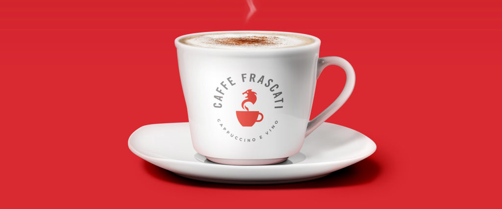
Bringing Italian style to a brand that makes a great cappuccino.
Italians are known for loving a great cup of coffee as much as they are known for great design. This identity combines the silhouette of a traditional cappuccino cup with the profile of a roaring lion – recalling the heraldic symbols of Italian noble families. The result is a modern icon inspired by ancient symbols. And this is the very nature of what is most charming about Italian culture – blendinga healthy respect for tradition with the vision to explore something new.
IMEMORIES
A brand reminding you that memories live in the heart.
iMemories helps people share their story and celebrate family by offering Analog to Digital Conversion Services and providing a single place for them to share and save their most meaningful photos and videos. When designing the logo, we realized that more than a technology story, iMemories was about a human story. The logo represents their mission to bring joy to people’s hearts by helping them relive generations of memories through memory conversion, archival and curation services.
Other Articles
The power of WAM: Interview with Edgar Baum
How focusing on the Winnable Addressable Market can optimize the effectiveness of branding and marketing investments
Read moreNonLinear: the new book by Kevin Bethune
Kevin Bethune shares his thoughts about the role of design, the importance of diversity and being a Black designer in corporate America.
Read moreRebrands create real value for Private Equity firms
Rebranding isn’t just a marketing exercise—it’s a financial growth strategy that can unlock value, drive revenue, and improve exit outcomes.
Read moreWant to build your brand value?
We help companies define their positioning strategies, craft compelling brand storytelling, execute brand communications, and deliver public relations programs that build awareness, differentiation and preference. Let’s discuss your business objectives and see how we could help you achieve them.


