ESPERANTO
An elegant brand for
an AI chip pioneer
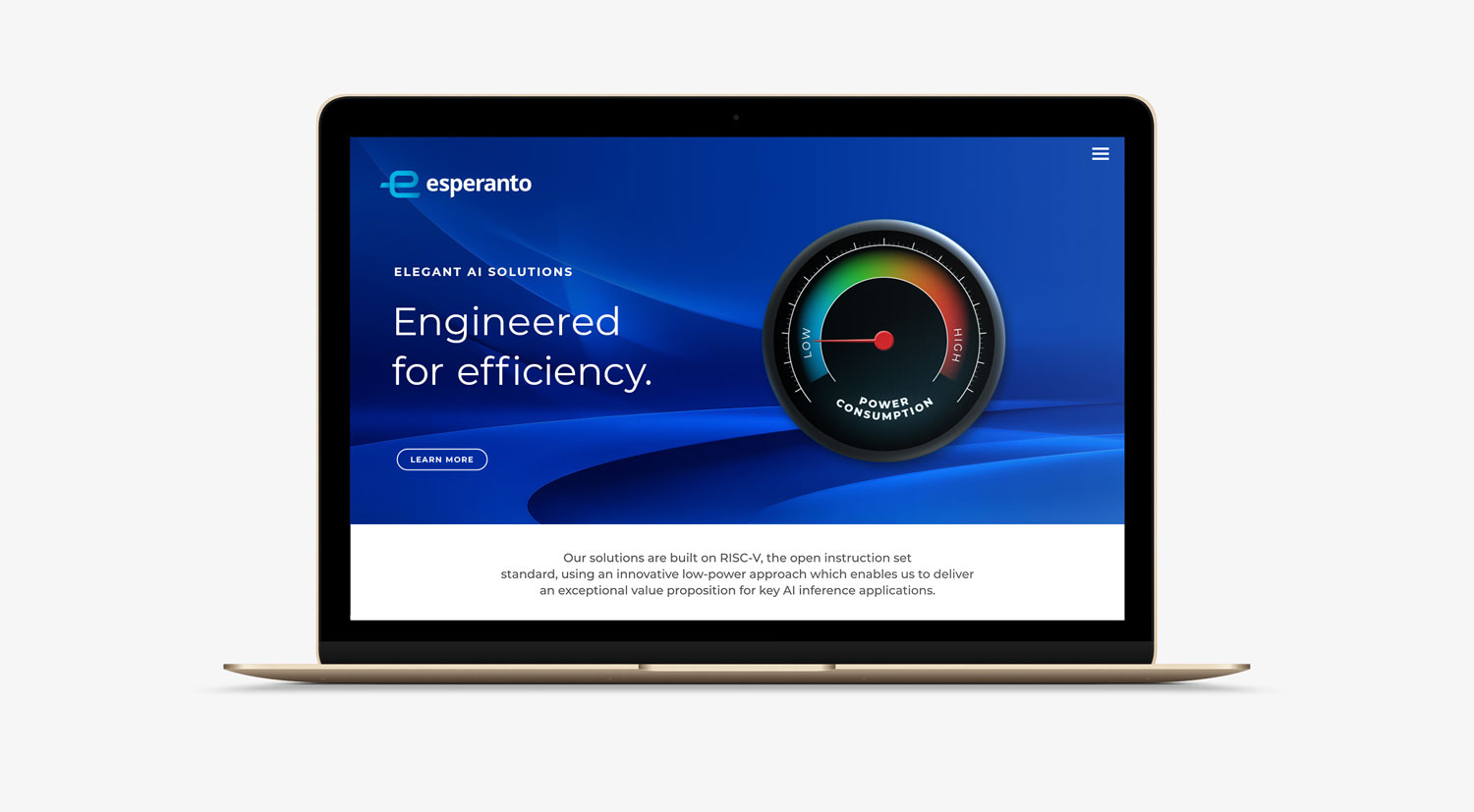
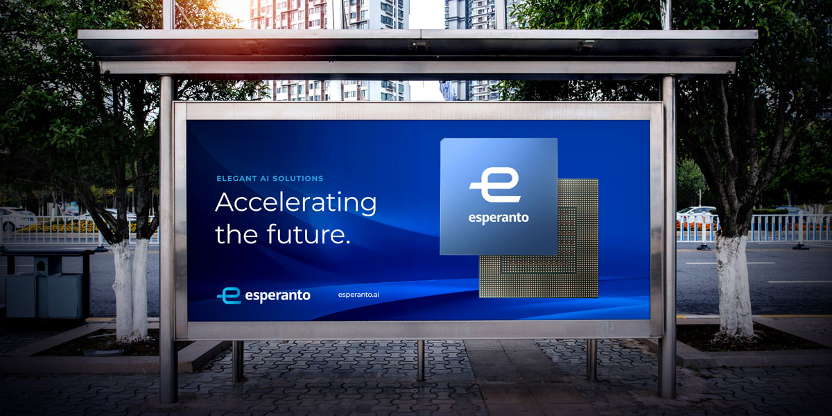
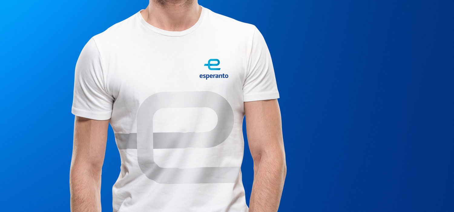
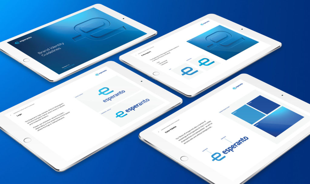
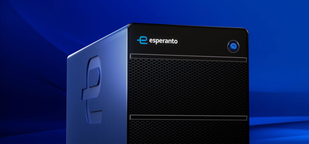
Esperanto makes highly advanced chips enabling system designers build the next generation of Al solutions. However, their brand was stuck in the past. In a matter of a few months, we crafted an entirely new brand identity, modernized the brand’s color scheme and launched a better website experience. Today the Esperanto brand is as elegant as their AI technology.

BEFORE
AFTER


BRAND DESIGN
Simplicity is the
ultimate sophistication
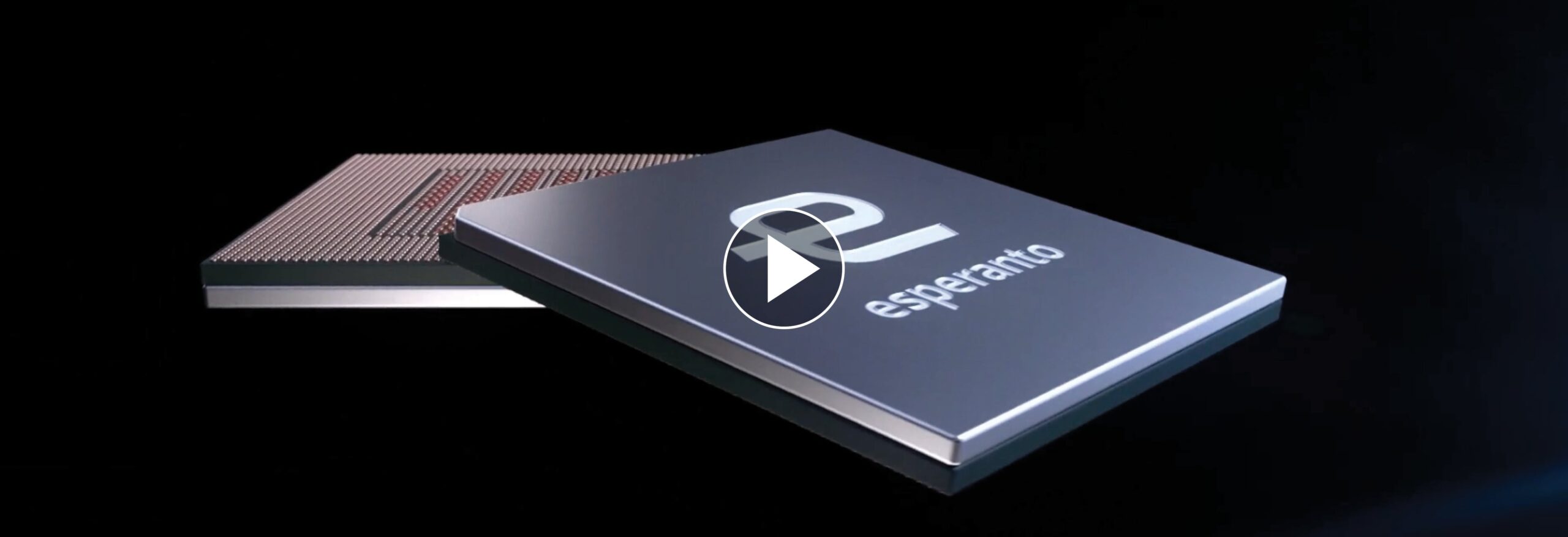
Steve Jobs once famously said “Simplicity is the ultimate sophistication. It takes a lot of hard work to make something simple, to truly understand the underlying challenges and come up with elegant solutions.” This idea resonated with Esperanto’s engineers who work hard at developing chips that are highly sophisticated, exceptionally energy efficient, and superbly scalable. This is why the brand identity consists of a simple monogram that stand for Esperanto, while also representing the engineering elegance that is built into their chips. Along with the new logo, we selected a very minimalist color palette and designed a new visual language that completely modernized the brand.
