BOOKKEEP
Accounting automation
gets a smarter brand.
Not all accounting automation software works the same. And no other company delivers a solution that is as effortless or scalable as the one offered by Bookkeep. Designed with professional accountants, this automated platform is the smarter choice for companies that want to eliminate manual processes, reduce costs and maximize accuracy. Bookkeep deserved a smarter brand strategy and much better design – and that’s exactly what we did for them.

BEFORE
AFTER


BRAND IDENTITY
Brighter is smarter.
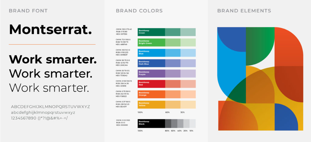
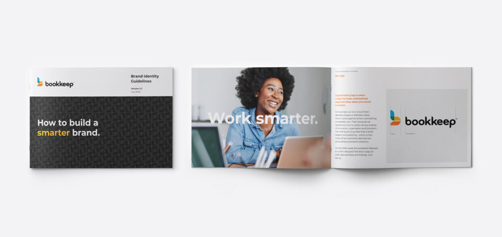
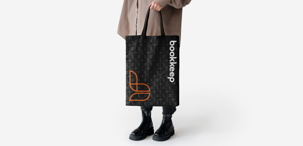
The Bookkeep icon is built with three identical elements in different colors that overlap to create the letter “b”. The multiple bright colors are designed to suggest the optimism of accounting automation and how it positively impacts not just the bottom line, but also the quality of life for accounting professionals. The shapes used to build the logo became a flexible branding element used across a wide variety of print, environmental and digital applications.


BRAND MARKETING
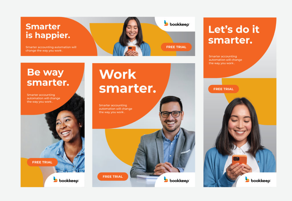
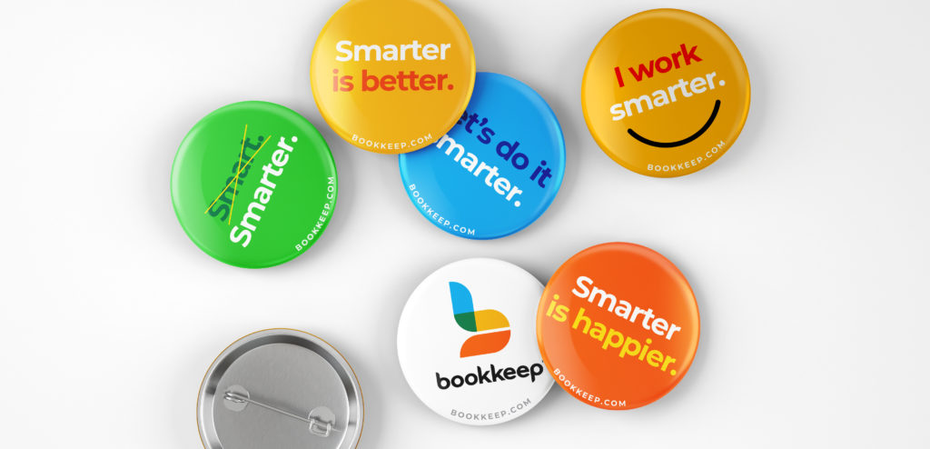
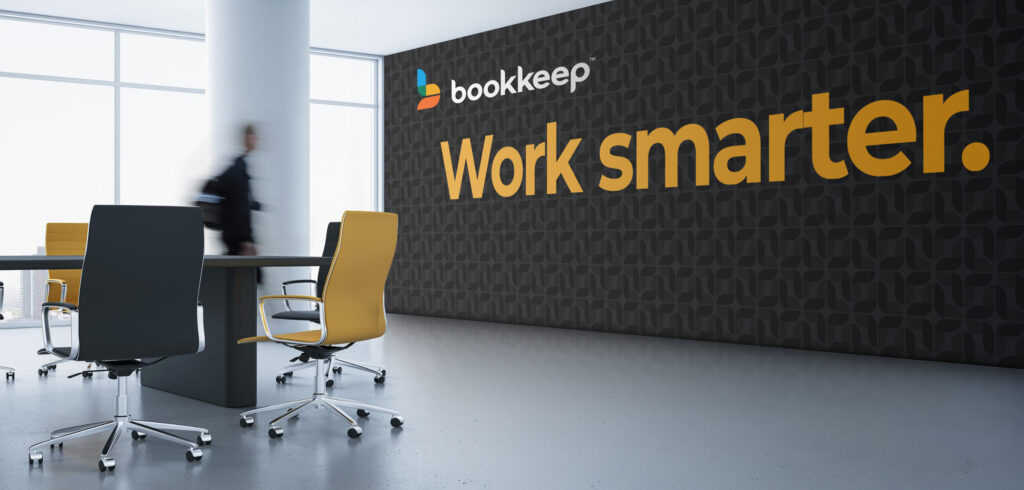
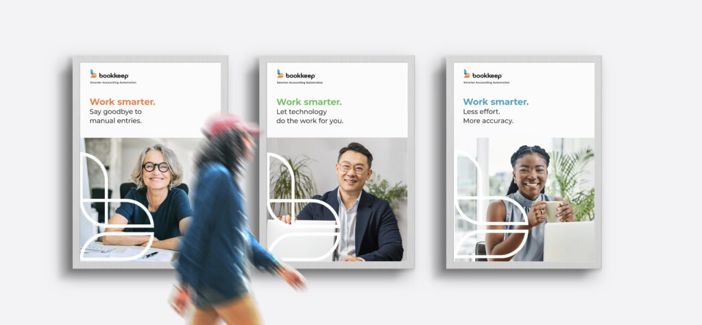
Branding that works smarter
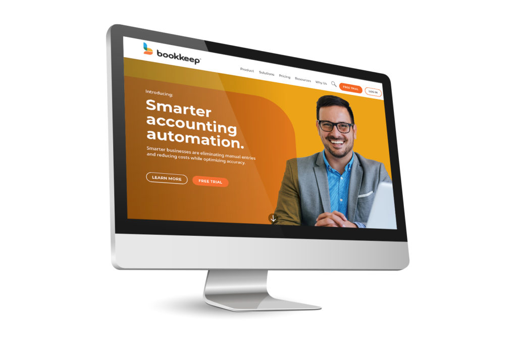
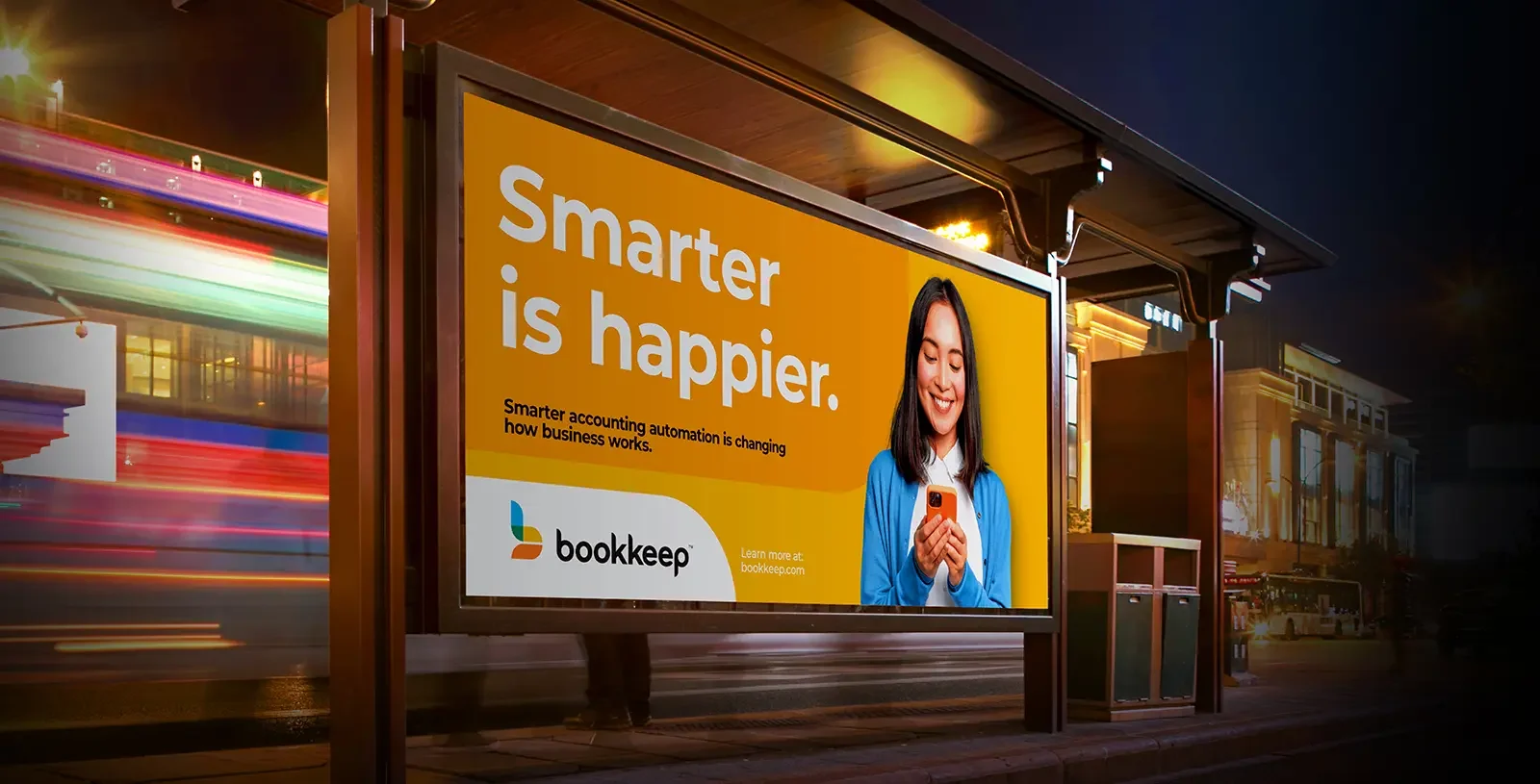
Bookkeep virtually eliminates those pesky repetitive and time-consuming tasks that often lead to bookeeping errors – consequently reducing costs, optimizing efficiencies, and improving the bottom line. This is why we positioned Bookkeep as the “smarter” accounting automation platform. After all, everyone knows that the goal is to work smarter.


